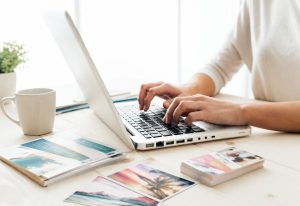
AI tools make it easier than ever to create marketing artwork in just a few clicks. But just like with logos, flyers, and brochures, a good-looking AI image on your screen does not automatically mean it will print well as a postcard.
At Redmond Imaging, more customers are starting with AI when they need artwork for print. This guide walks through a simple start-to-finish example using a postcard for a local childcare organization, so you can see how to create print-ready AI images with ChatGPT, choose an image generator, and avoid the color and file issues that often show up when a design moves from screen to press.
One of the easiest ways to improve AI images for print is to think about the final piece before you generate anything. If you tell the AI that the image is for a printed 5.5″ × 8.5″ postcard, with no text in the image and natural, print-friendly colors, you are much more likely to get something usable than if you just type “summer camp for kids.”
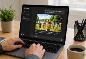
ChatGPT is the most common AI program our customers use for creating their AI images. The first step is to use ChatGPT to help you write a clear, detailed prompt—the set of AI instructions you type in to describe what you want—and the second step is using that prompt to generate the actual image. The free version of ChatGPT can do both, but it does have limits on how many images you can create in a short period of time. The paid version has fewer limitations, which can be helpful if you are creating a lot of AI images for different print projects.
> **Side note:** The sample prompts below are written for ChatGPT to help you build better prompts, but the final prompt language can be used in almost any AI image creator.
A postcard example: a local childcare organization
For this example, imagine a local childcare organization is mailing a postcard to families to recruit kids for summer camp. That makes this a useful real-world print project because the postcard has to feel friendly, active, safe, and trustworthy while still leaving room for the final marketing message.
It also needs AI images that leave room for headlines, dates, and contact information when the final postcard is designed.
Before generating anything, decide a few basics:
- Final piece: 8.5″ × 5.5″ postcard.
- Orientation: vertical or horizontal.
- Style: realistic photo look, painterly illustration, or bright lifestyle imagery.
- Color direction: cheerful and energetic, but still natural enough to print well.
- Layout goal: keep the main subjects away from the edges so there is room for bleed and safe area later.
Now that you know what you want the postcard to look like, the next step is to turn that into a strong prompt inside ChatGPT. Instead of typing a short phrase like [kids at summer camp], ask ChatGPT to help you write a full, detailed prompt that covers the subject, mood, colors, and layout for print.
A simple starter prompt to paste into ChatGPT could be:
[Help me write a detailed AI image prompt for a printed 8.5″ × 5.5″ postcard for a local childcare organization promoting summer camp. The image should show elementary-age kids enjoying summer camp activities outdoors. Make it bright, welcoming, family-friendly, and realistic. Use natural, print-friendly colors, leave room for text, do not include any words in the image, and compose it so important subjects are not too close to the edges.]
That prompt does a few important things right from the start. It tells the AI what the piece is for, gives it a specific subject, asks for realistic color, and prevents one of the most common AI images problems for print: random text baked into the artwork.
Create a realistic, professionally photographed style image for a printed 8.5″ × 5.5″ summer camp postcard for a local childcare organization. The scene should feature a diverse group of elementary-age children (approximately ages 6–10) happily participating in outdoor summer camp activities on a warm sunny day. Include activities such as running through sprinklers, playing group games, doing arts and crafts at picnic tables, blowing bubbles, and laughing together in a grassy park-like setting with trees and soft natural sunlight.
The mood should feel bright, welcoming, safe, energetic, and family-friendly while still looking authentic and natural rather than overly staged. Show genuine smiles and interaction between children. Include a few camp counselors in the background casually supervising and interacting positively with the kids.
Use clean, natural, print-friendly colors with balanced contrast. Avoid overly saturated neon colors or artificial HDR effects. Favor soft summer tones including sky blue, grass green, warm sunlight, light yellow, and cheerful primary colors in clothing.
Composition requirements:
- Landscape orientation for an 8.5″ × 5.5″ postcard
- Leave generous negative space for marketing text and logo placement, especially in the upper right and lower left areas
- Keep important subjects safely inside the composition with clear margins away from edges for print trim safety
- Avoid placing faces or important elements near the outer 0.5 inches of the image
- Create depth and layered composition suitable for professional print marketing
- No words, typography, signs, logos, or watermarks anywhere in the image
Style requirements:
- Realistic photography style
- High-resolution commercial advertising quality
- Natural lighting
- Slight depth of field for a polished professional look
- Designed specifically for postcard printing
- Crisp detail suitable for CMYK print production
- Family-oriented community organization aesthetic
Optional enhancement:
Add subtle visual storytelling details such as backpacks, colorful summer camp supplies, picnic blankets, playground equipment, sidewalk chalk, or a shaded pavilion in the background to help communicate a full summer camp experience.
Step 2: Better prompt examples for AI images

Option 1: Realistic lifestyle image
[Create a realistic, high-detail summer camp scene for a printed 8.5″ × 5.5″ postcard promoting a local childcare organization. Show a diverse group of elementary-age children outdoors playing an organized camp game with counselors nearby. Bright summer lighting, genuine smiles, active movement, clean composition, natural grass and trees, family-friendly atmosphere, natural print-friendly colors, no text, no logos, leave open space near the top and bottom for postcard headlines, keep important faces and subjects away from the edges.]

Option 2: More local and community-oriented
[Create a welcoming summer camp image for a 8.5″ x 5.5″ printed postcard for a local Greenville SC childcare organization. Show children arriving for camp with backpacks, cheerful counselors greeting them, and a safe, organized outdoor setting. Use realistic photography style, warm morning light, clean background, natural skin tones, print-friendly color palette, no text, no signage, no distorted hands or faces, and keep the composition centered with extra room for postcard text.]

Option 3: Action-focused camp energy
[Generate realistic artwork for a 8.5″ × 5.5″ include a bleed of .125″ on each side printed summer camp postcard. Show kids participating in an energetic outdoor camp activity with cones, games, and teamwork. The image should feel exciting, trustworthy, and parent-friendly. Use bright but natural colors that will reproduce well in print, no neon effects, no text, no watermark, no overly busy background, and frame the scene so the center remains the strongest focal area for a postcard design.]
These examples are useful because they do more than describe a subject. They also tell the AI how the image will be used in print, which helps reduce awkward compositions, strange colors, and cluttered backgrounds in AI images.
Once ChatGPT has helped you shape a clear, detailed prompt, the next step is to use that prompt to generate your AI images. In most cases, you can stay right inside ChatGPT, paste in the final prompt, and create the postcard artwork there, keeping an eye on the free image limits. If you already have a favorite image generator, you can also copy the exact same prompt into that tool and follow the same print-friendly steps.
Note: The good news is that the prompt approach stays about the same no matter which tool you use. If the prompt clearly describes the subject, style, print purpose, and color direction, you are already in much better shape when creating AI images for print.
| Tool | Typical cost level | Good fit for | Print note |
|---|---|---|---|
| ChatGPT with DALL‑E | Free tier with limits; paid plans unlock more generations | All‑in‑one text and AI images in a single interface | Great starting point; always download the largest image size and let Redmond confirm it is big enough for print. |
| Midjourney | Subscription plans starting around $10/month | Highly stylized, polished artwork | Upscale the final image and check resolution before dropping it into a postcard layout. |
| Adobe Firefly | Included in some Adobe plans; dedicated plans start around entry creative tiers | Designers already using Photoshop/Illustrator | Convenient when AI images will be refined in Adobe apps and then sent to print as PDFs. |
| Canva AI | Free tier with paid Pro plan for heavier use | Quick social and print layouts in one place | Build the postcard layout and then export a print‑ready PDF or high‑resolution PNG. |
| Stable Diffusion tools | Often free or low‑cost; some hosted tools are paid | Advanced users who want more control | Always double‑check image size and clarity before sending files for professional printing. |
Step 4: Understand color before you print
This is where many customers get surprised. Screens use RGB color, which is made with light, while printing uses CMYK inks on paper, so some bright colors you see on a monitor simply cannot be reproduced exactly the same in print.
That is why wording inside the prompt matters. Asking for “natural, print-friendly colors,” “warm realistic lighting,” or a “soft, balanced palette” usually leads to better print results than asking for neon glows, ultra-saturated colors, or extreme contrast.
A practical way to explain it is this: paper does not glow. If a screen color is extremely vivid because it is being lit from behind, the printed version may look more muted after conversion to CMYK, even when the file is prepared correctly.
Some color adjustments can still be improved before production. Files can often be optimized, toned down, corrected, and proofed before the job goes on press, which is one reason it helps to send the file to Redmond Imaging before placing the order.
Step 5: Export the right file type
For a simple postcard image, ChatGPT usually provides a high-resolution PNG. That file can be opened in an image editor and saved in another format if needed. It can also be placed into a design program such as Canva, Photoshop, or another layout tool before creating the final print-ready file.
The file type is not the only thing that matters. What matters most is whether the image has enough real pixel detail for the finished postcard size. That is why the first post in this series covered resolution, upscaling, bleed, and safe area.
When using AI artwork as part of a larger postcard design, keep these simple guidelines in mind:
- Use the largest image size your AI tool will give you. (ChatGPT typically creates AI images at about 1024 × 1024 pixels, which is only around 3.4 inches on each side at 300 dpi. For larger print pieces like a 8.5″ × 5.5″ postcard, you will usually need to generate a bigger image with a dedicated AI image generator such as Midjourney, or keep the AI image as a smaller featured element within the layout.)
- Keep text out of the AI-generated image itself when possible.
- Build the final postcard layout in a design program so bleed and safe margins can be set correctly.
- Export a print-ready PDF if your design program supports it.
Before you upload the final postcard, ask a few quick questions:
- Do the AI images fit a 8.5″ × 5.5″ postcard without looking soft or blurry?
- Are the main faces and subjects far enough from the edges to allow for trimming?
- Are the colors realistic enough to hold up well when converted from screen color to print color?
- Did you export the largest and cleanest file available?
If the answer to any of those is uncertain, that is exactly where Redmond Imaging can help. A quick file review before production can catch color, size, bleed, and format issues before they turn into disappointing postcards.
AI is making it easier for businesses to create artwork quickly, but print still has rules that matter. When you start with a better prompt, choose a sensible image tool, and prepare AI images with print in mind, you have a much better chance of getting postcards that look professional in the real world, not just on a screen.
Not sure if your AI images are really ready for print? Send your files to Redmond Imaging, and the team will check resolution, color, and file type so you can order with confidence.